
FSAE Telemetry Tracker
A SQL Server pipeline that turns a raw race-day logger file into per-driver, per-stint data the team can compare in Power BI.
The Problem
Race-day telemetry comes off the car’s logger as one long CSV sampled at 20 Hz. The file has no label for who was driving, and it includes long stretches where the car is sitting still.
We needed a repeatable way to turn a raw logger file into clean, per-driver, per-stint data the whole team could compare on the track.
Approach
The pipeline loads a logger CSV into SQL Server, finds where the drivers swapped, labels every row with its driver and stint, and passes the labelled table to Power BI. Each step is a SQL script run in order, with written instructions for the team.
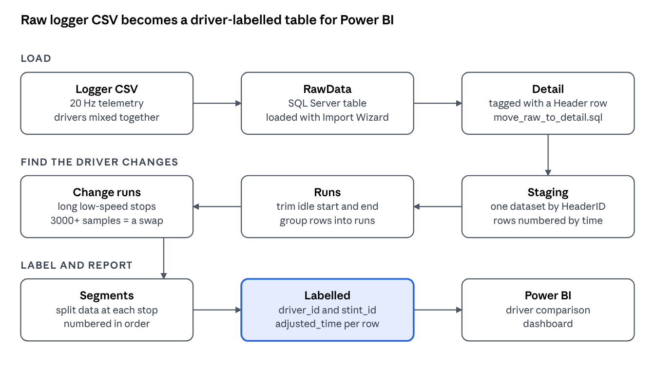
Import the CSV into the RawData table with the SQL Server Import Wizard in SSMS. Add a row to the Header table that describes the data, then run move_raw_to_detail.sql with that Header ID to move the rows into the Detail table.
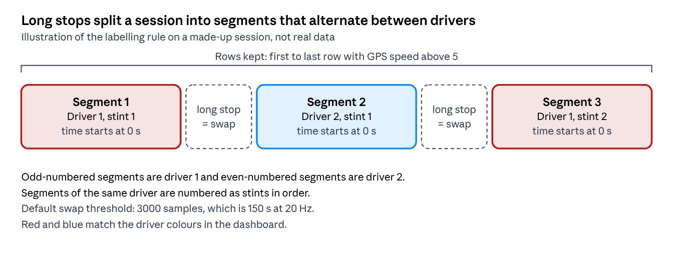
Each long stop closes a segment, and the next segment belongs to the other driver.
Outcome
The Power BI report reads the Labelled table and compares drivers side by side from a single log file. A summary table lists top speed, average speed, average throttle position, average motor speed, negative torque command time, and maximum lateral and longitudinal G. The charts are coloured by driver, with red for driver 1 and blue for driver 2.
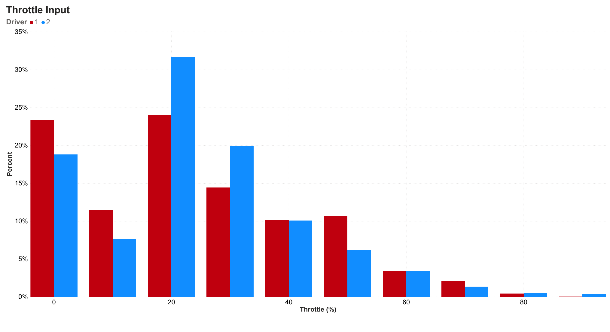
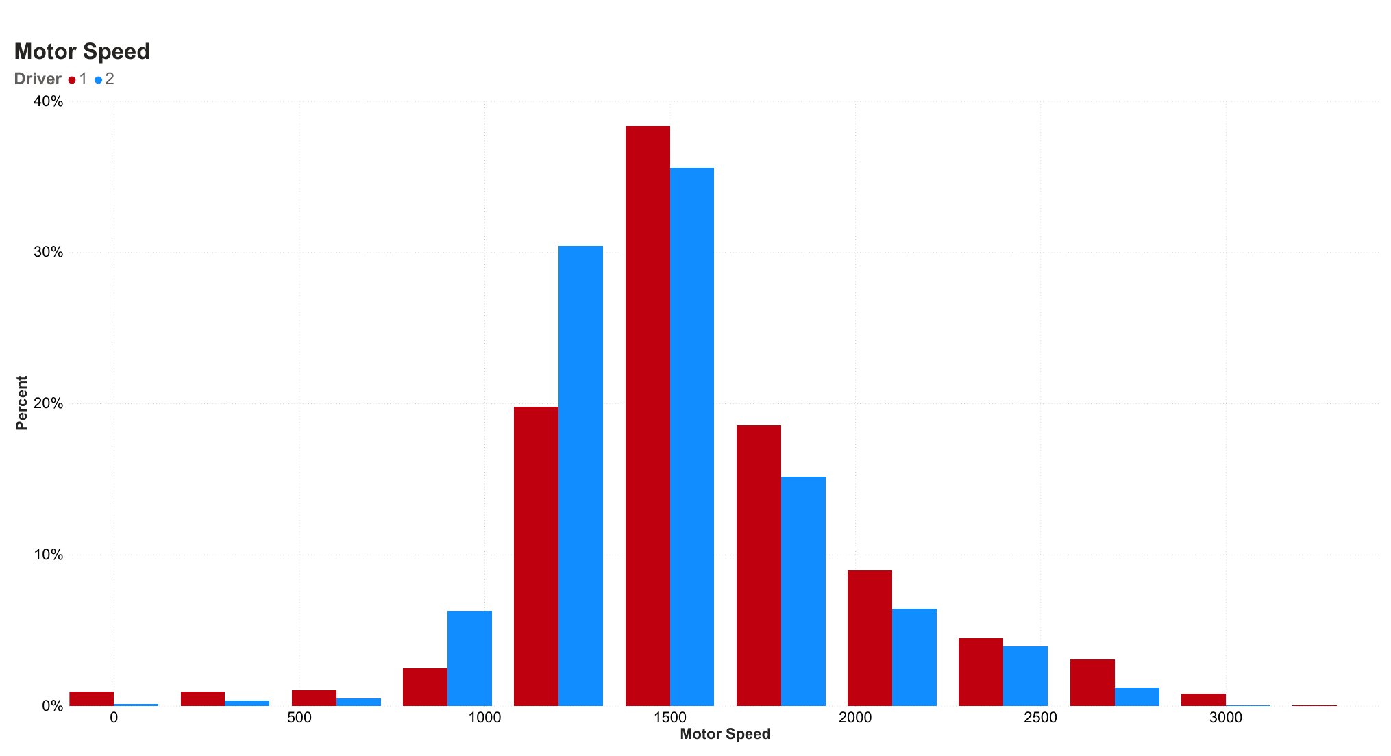
Histograms of throttle input and motor speed, shown as the share of each driver’s samples so drivers with different amounts of driving time can be compared.
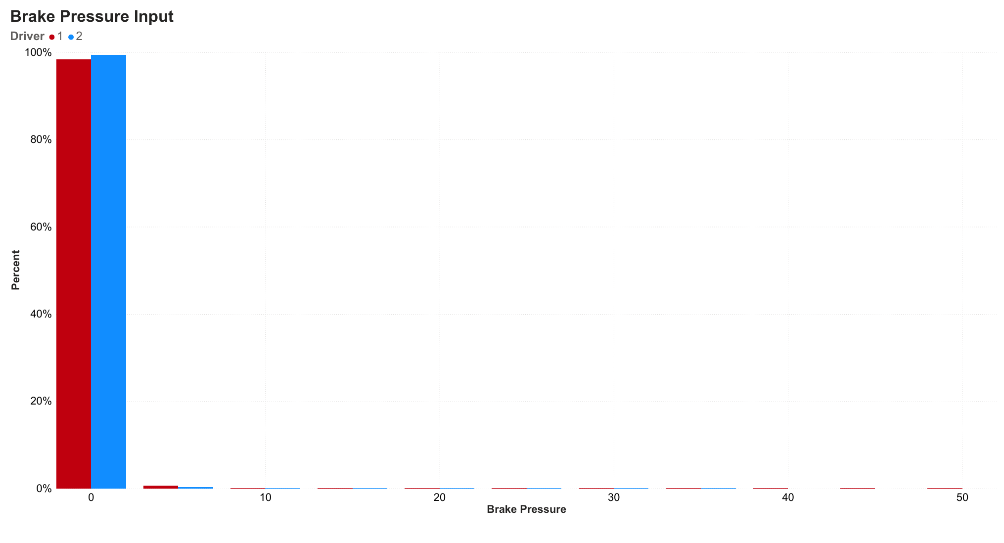
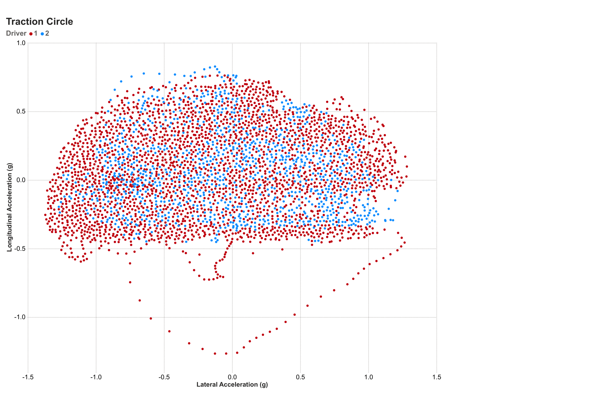
A brake pressure histogram and a traction circle, which plots lateral against longitudinal acceleration for each driver.
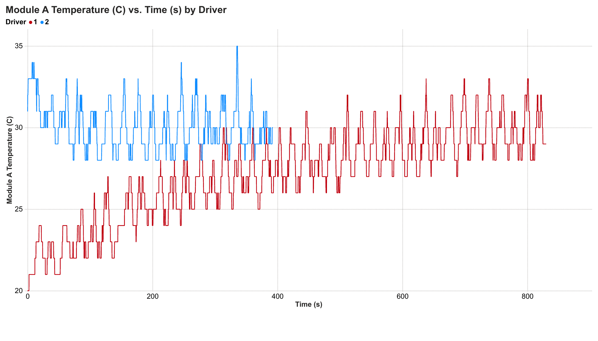
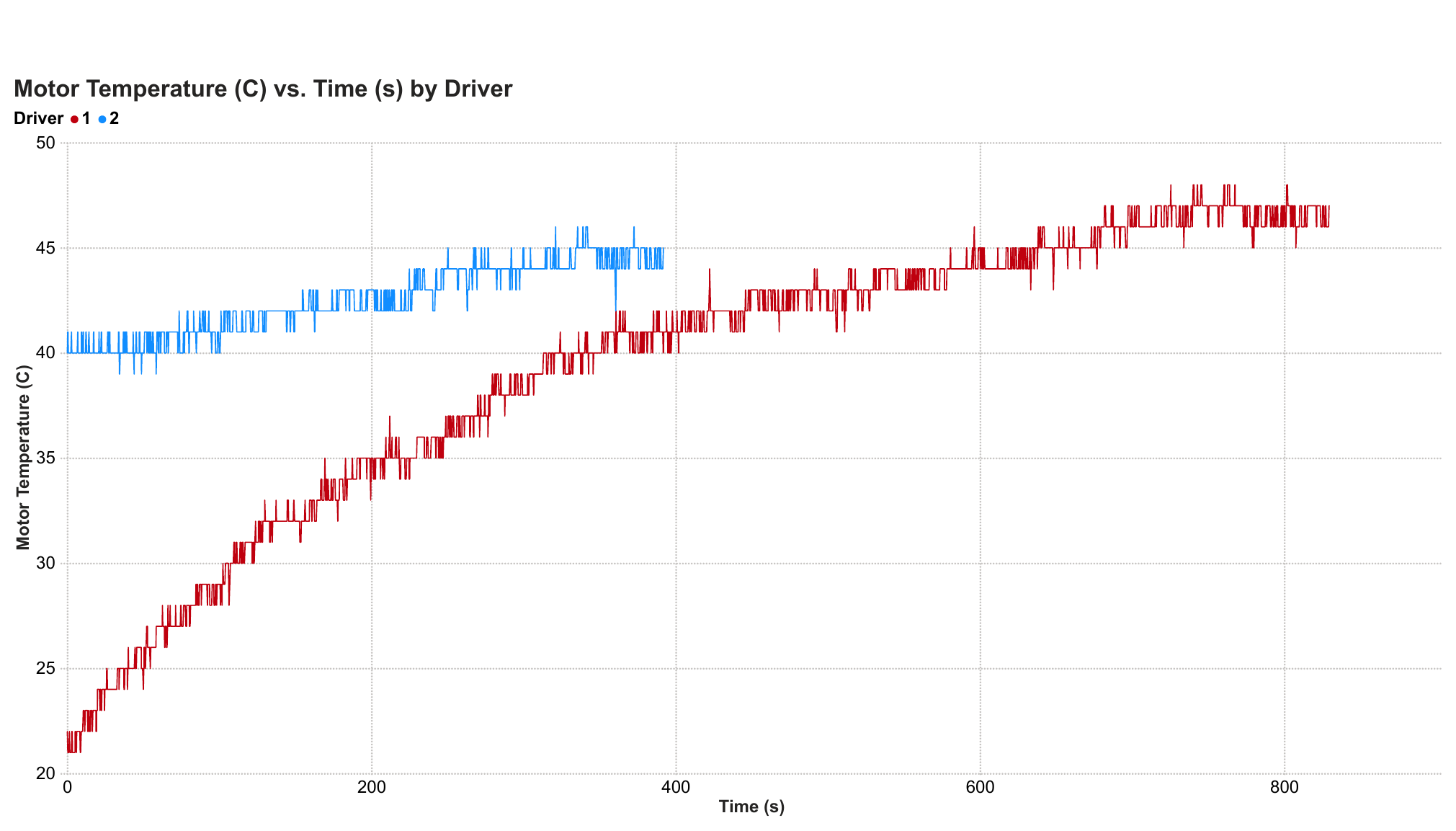
Line charts of module and motor temperature against time, one line per driver.